
Related Stories

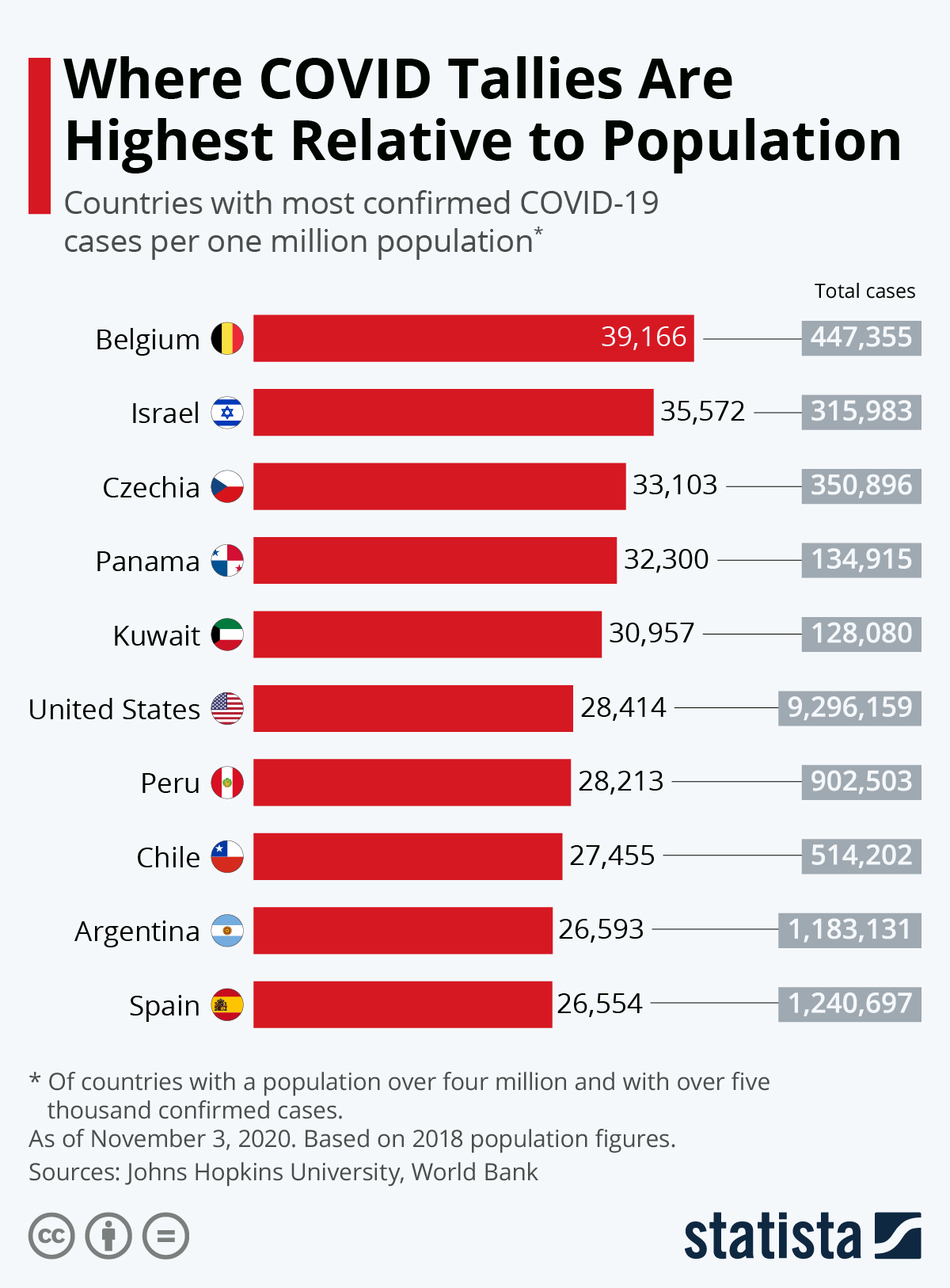
Although the situation is fluid, the countries worst hit by the COVID-19 pandemic are by now well known. How does this look though when accounting for population size?
Using Johns Hopkins University and World Bank figures, this infographic takes countries with a population of at least four million and over five thousand confirmed cases and calculates the rate per one million inhabitants. Using this measure, Spain has the most severe rate with 4,252 cases, followed by Belgium and Ireland. The United States, the country with by far the most cases, still has a relatively low figure in comparison, 2,322, but is currently rising up this ranking.
Of course, the number of actual cases in a country is going to be higher than official figures show, with testing rates also varying dramatically. As with all figures relating to confirmed cases, they should be treated with caution.
source statista
also read
Coronavirus – 115 deaths in Greece
Oil prices continue to plummet amid coronavirus crisis
You will find more infographics at Statista