
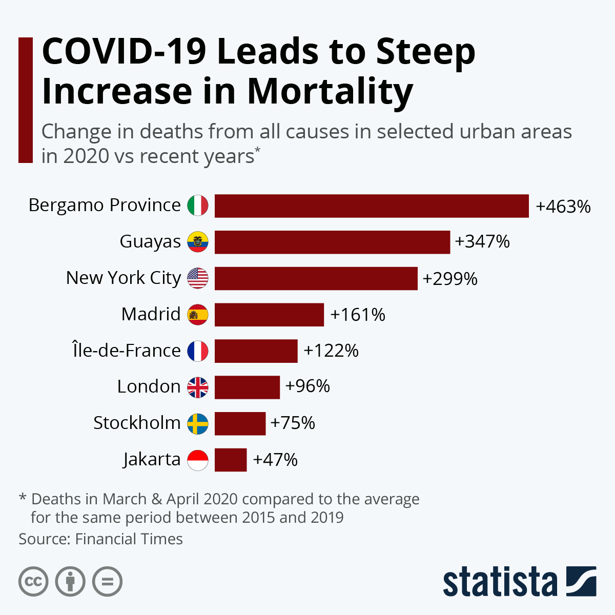
An analysis by The Financial Times shows just alarming mortality rates from COVID-19 truly are. It looked at excess mortality in the countries and the urban areas worst affected by the pandemic and found that the number of people dying in recent weeks has been much higher than usual. Specifically, it looked at deaths from all causes in the weeks of a location’s outbreak in March and April 2020 compared to the average for the same period between 2015 and 2019
The data highlights major inconsistencies in global data about COVID-19 deaths and John Burn-Murdoch from the Financial Times stated that “the numbers are remarkable, and put to bed the idea that Covid-19 is akin to a bad flu season”. For example, Ecuador’s Guayas province reported 245 deaths from COVID-19 between March 01 and April 15 but the analysis shows that 10,200 more people died in that period than in a typical year – an increase of nearly 350 percent.
also read
Coronavirus death toll at 138, after man, 84, dies
Esty shares soar as people turn to face masks (infographic)
In the Northern Italian region of Lombardy which has been badly impacted by COVID-19, 4,348 deaths have been attributed to the disease across 1,700 municipalities. The Financial Times analysis noted nearly 13,000 excess deaths, an increase of 155 percent on the historical average. The city of Bergamo and the region surrounding it had the highest increase out of any urban area in the analysis at 464 percent while New York’s increase was approximately 300 percent.
source statista
You will find more infographics at Statista
Image by Gordon Johnson from Pixabay