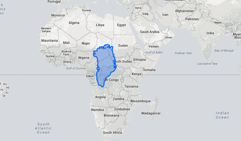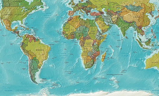
We have been accustomed to seeing countries on the maps called ‘Mercator projection maps’. The Mercator maps are cylindrical projections of countries on the globe and were first introduced in 1569 by a Belgian geographer and cartographer named Gerardus Mercator. Since then most of us have accepted that these maps accurately represent the size of each country in relation to others. But in reality what we see on these maps in terms size relation between countries is a lie! Mercator maps exaggerate regions far from the equator, making Europe, for example much larger than what it actually is. An even more characteristic example of this distortion is the fact that even though we think of the island of Greenland as huge in comparison to other regions on the planet, it is actually 14 times smaller than the African continent. Or Russia is only twice the size of the USA in land mass. If you want to see what the real sizes of countries are in relation to one another visit this site: thetruesize.com
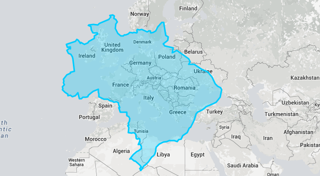
Size of Brazil (light blue) in comparison to Europe
Size of Greenland (blue) in comparison to Africa