It’s not that Africa is shown as being too small on the majority of world maps, it’s how almost every other part of the world has been artificially inflated. If we want someone to blame for this distortion, then we need look no further than the year 1569 when the cartographer Gerardus Mercator devised a solution to the problem of representing a globe on a 2D map’s surface.
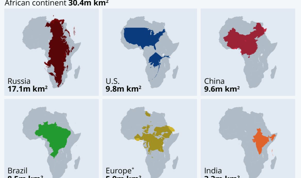
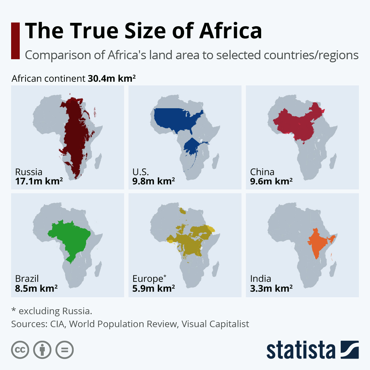
Mercator’s projection was revolutionary and invaluable for nautical navigation, but in the modern era, is outdated and wildly inaccurate. You can see this for yourself quite easily – taking a look at this accurate infographic, you can see how almost the entire length of Russia fits into the African continent when turned by 90 degrees. Now go to Google Maps (or wherever you satisfy your cartographic needs) and measure the length of Russia with your hand, compared to Africa. It doesn’t fit, and it isn’t even close. The Mercator-based distortion makes the country appear roughly twice as long from West to East as Africa is from North to South.
You will find more infographics at Statista
also read
Covid-19 certificates scrapped from May 1 in Greece
Ask me anything
Explore related questions