Although the situation is fluid, the countries worst hit by the COVID-19 pandemic are by now well known. In Asia, China and Iran have so far recorded the most cases. In Europe, Italy and Spain are at the centre of the outbreak, and of course the United States in North America. How does this look though when accounting for population size?
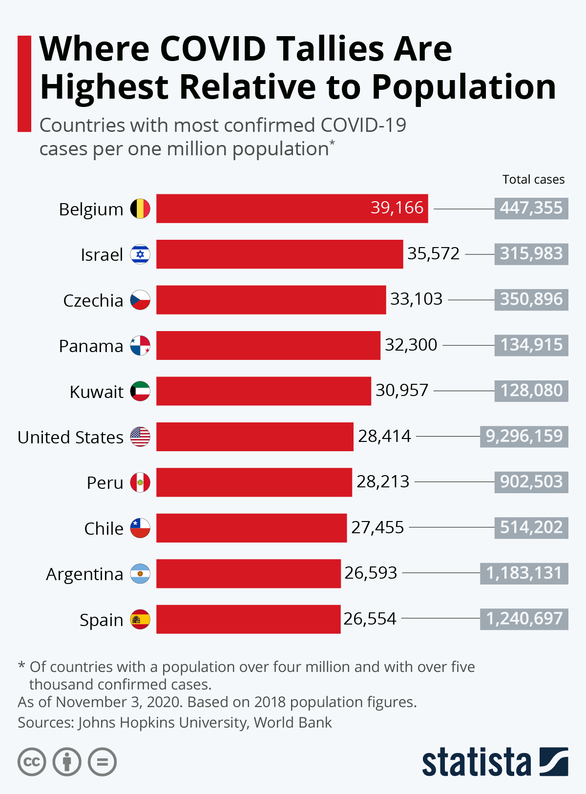
Using Johns Hopkins University and World Bank figures, this infographic takes countries with a population of at least four million and over two thousand confirmed cases and calculates the rate per one million inhabitants. Using this measure, Spain has the most severe rate with 3,038 cases, followed by Switzerland and Italy. The United States, the country with by far the most cases, still has a relatively low figure in comparison, 1,222.
Of course, the number of actual cases in a country is going to be higher than official figures show, with testing rates also varying dramatically. As with all figures relating to confirmed cases, they should be treated with caution.
source statista
You will find more infographics at Statista
read more
The Biggest Financial Contributors To The WHO (infographic)
European Commission approves 1.2 billion euros to support Greek economy
Ask me anything
Explore related questions